|
|
|
|
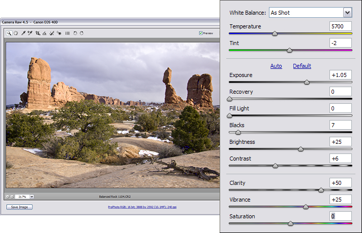
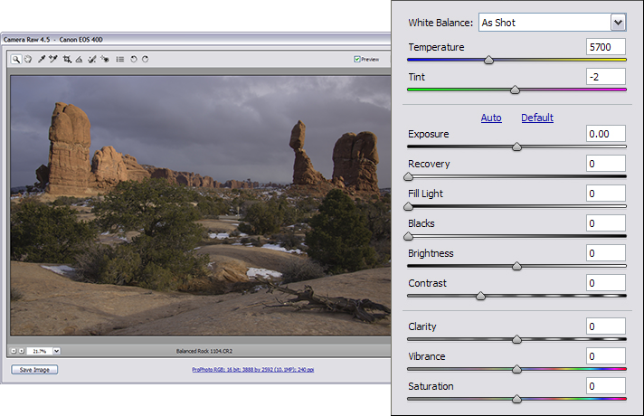
Keeping an Open Mind I’ve processed thousands of images in Photoshop for more than 10 years as a nature photographer and for more than 5 years as a professional fine arts image editor. Over the course of several articles, I’m going to share techniques with you that I think will help you process your nature and wildlife photos. The manner in which you process an image will be determined by the way you plan to use that image. An image may be published in a magazine, displayed as a fine art print, entered into a contest, inserted in a travel album for personal memories, or presented on the web. Each type of usage entails its own processing method. In this article, to explore the basics of image editing, we’ll develop the image for web presentation. We will use some unconventional processing methods to demonstrate some of Photoshop CS3’s frequently untapped power. We’re going to process a photo of Balanced Rock from Arches National Park in Moab, Utah. If you want to follow along with this tutorial, you can access the Raw file in Adobe DNG format here: balancedrock.dng (Copyright ©2008 Lance Warley) Step 1: Develop in Camera Raw The goal of this step is to retrieve every bit of information recorded by your camera’s sensor when you took the photo. We’re going to open the image in using Adobe Camera Raw, so the settings discussed here only pertain to Adobe Camera Raw or Adobe Lightroom. Here’s the original Raw file with no processing other than the White Balance set in the camera. The Temperature is 5700, the Tint is -2, and all the other sliders are set to 0. The color space is ProPhoto RGB; 16 bit:
Before you do anything else, decide if the image’s focus is sharp or not. If an image is out of focus, trash it, because no amount of processing will fix it. This image is sharp, so we’ll proceed.
Move the Exposure slider all the way to right until the black triangle in the upper right corner of the screen lights up. When the triangle lights up, it’s telling us that we’re overexposing the image. Move the slider slightly to the left until the triangle is black again. Now the Exposure slider is set. Move the Blacks slider to the right until the left triangle turns blue. Then move it to the left until it turns black. Now the Blacks are set. Then adjust the Brightness, Contrast, Clarity, and Vibrance sliders based upon your visual judgment, keeping an eye on the histogram to avoid over- or underexposing any portions of the photo. If any highlights become blown, i.e., overexposed, then move the Recovery slider to the right until the red overexposure warnings disappear. With the settings I have chosen, the photo now looks like this:
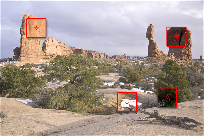
The values of the sliders are Exposure: +1.05, Blacks 7, Brightness +25, Contrast +6, Clarity +50, and Vibrance +25. Click Open Image and the file will open in Photoshop, where we will complete its processing. Step 2: Implement Image Monitoring Now that the image is open in Photoshop, open the Info Pallet (Window-Info). This allows you to keep track of what your changes are actually doing to your image. Select the Color Sampler tool (stored under the Eyedropper tool) and examine the image to determine its brightest point, darkest point, and two other significant points. Click on each of these 4 points with the Color Sampler tool. The 4 points will be displayed in the Info Pallet with their Red-Green-Blue values. This provides a numeric representation of how the highlights, shadows and midtones change as you process the image. I selected a patch of foreground snow for the brightest point (1), a spot in the foreground bushes for the darkest point (2), the rock in the left background for the third point (3), and the rock in the right background for the fourth point (4). This screen shot enlarges the areas of the photo with the Info Pallet points, while reducing the opacity of the overall image, to increase visibility to the 4 points:
The rocks and boulders in the background are two main points of interest. Since there are no other significant areas of shadows and highlights, it will be a good idea to keep an eye on the midtones in the background image. The one on the left is a light midtone and the one on the right is a dark midtone. The values for each of the 4 points in the Info Pallet are:
Here’s a blown-up view of the Info Pallet: 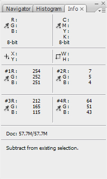
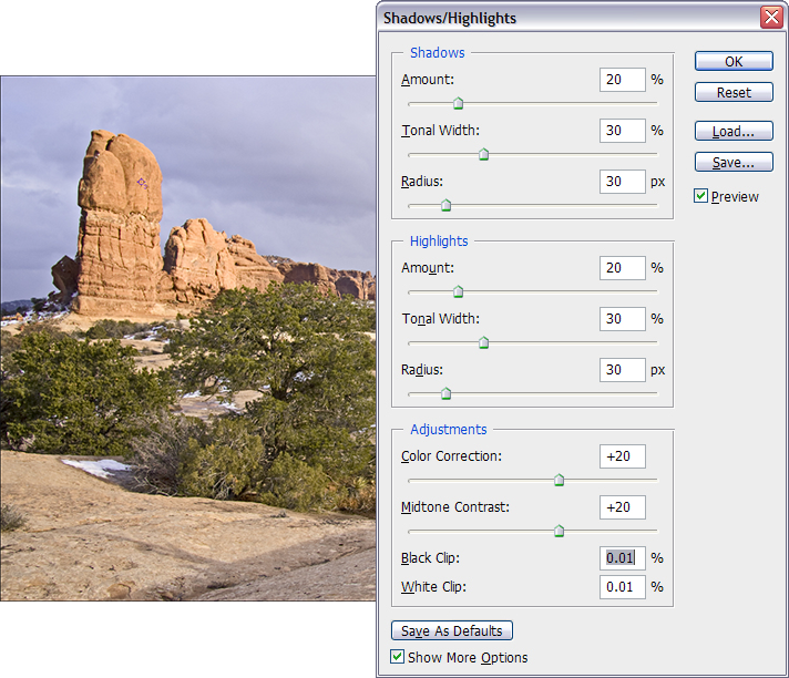
We will pay continual attention to the Info Pallet as we add layers and edit the image, to ensure the values don’t go to 255 or 0, so that we don’t muddy the shadows or blow out the highlights. Step 3: Improve the Exposure We will improve the quality of the highlights, shadows and midtones by pulling as much data as possible into the image without making the image appear unrealistic. A.) Duplicate the background layer and name it H&S for highlights and shadows. Open Image → Adjustments → Shadow/Highlight. Make sure that the box labeled “Show More Options” is checked. Change the values in the Shadows, Highlights, and Adjustments areas of the dialog box to: Shadows Amount 20, Tonal Width 30, Radius 30; Highlights Amount 20, Tonal Width 30, Radius 30, and Midtone Contrast +20. The image now looks like this:
These are the default numbers I use to start off with. These numbers generally work with most images that have been developed properly in Camera Raw. The values in the Info Pallet are now:
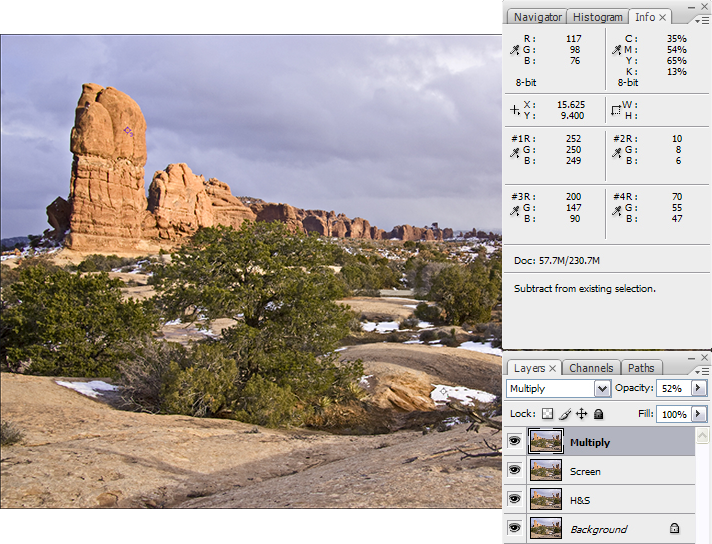
At this point and after each additional change as we process the file, you should save the image as a PSD file type. B.) Duplicate the layer, rename it Screen, and select the Screen blend mode. C.) Duplicate the layer again, name it Multiply, and select the Multiply blend mode. Move the Opacity sliders on the Multiply and Screen layers until the image looks better, keeping an eye on the Info Pallet to not blow out any highlights or shadows. I ended up with the Multiply layer at 52% opacity and the Screen layer at 48% opacity.
The values in the Info Pallet after Screen and Multiply are:
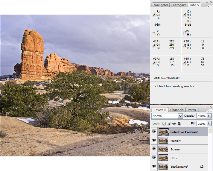
The image at this point now is now reasonably adjusted for exposure. Now let’s give it some “Pop.” Select Ctrl-Shift-Alt-E (Mac Users: Command-Shift-Alt-E) to merge the visible layers. Rename the new layer Selective Contrast. D.) Select Image → Adjustments → Selective Color. Selecting each of the colors, move the Black slider backwards and forwards to see what improves the image, keeping an eye on the Info Pallet so that we don’t blow out the highlights. In this image, I made adjustments to the Black slider for each of these colors: Reds +43, Yellows +29, Blues +37, and Neutrals -11. Click OK and the image looks like this:
The values in the Info Pallet after Selective Contrast are:
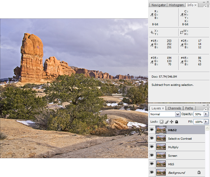
E.) Duplicate the layer and name it H&S2. Open the Shadow/Highlight dialog box and use the same values as last time, but don’t add any Midtone Contrast: Shadows Amount 20, Tonal Width 30, Radius 30; Highlights Amount 20, Tonal Width 30, Radius 30. Then adjust the Opacity slider to 50%.
The values in the Info Pallet after the second dose of Shadows and Highlights are:
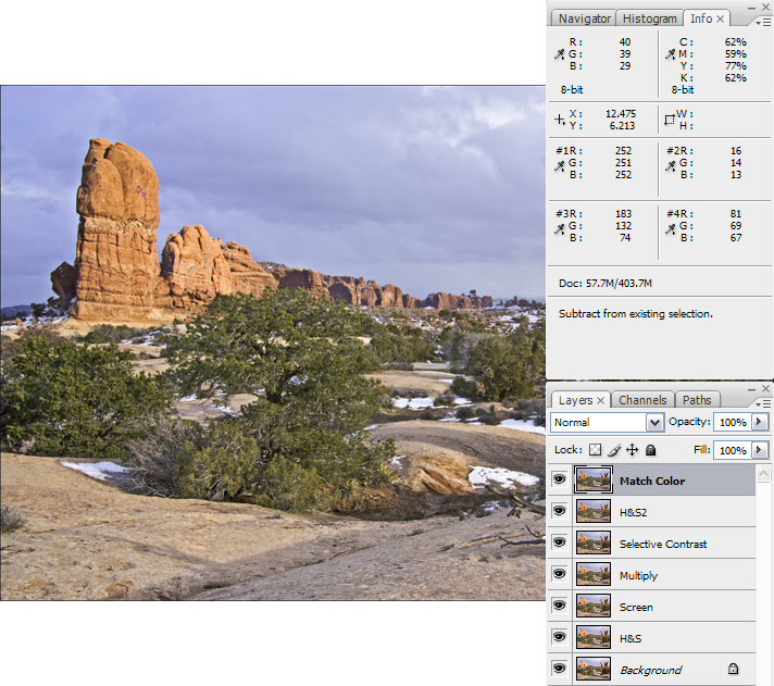
Now let’s check for a color cast and apply a final tweaking to the image. F.) Click Ctrl-Shift-Alt-E (Mac Users: Command-Shift-Alt-E) to merge all visible layers. Rename the new layer Match Color. Select Image → Adjustments → Match Color. Check the Neutralize box and Fade the slider to a pleasing color tone. I faded the slider to 50. This reduces the yellow cast, creating more contrast between the sky and the big rocks, which adds to the dynamic drama of the image.
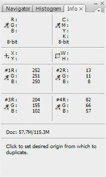
The values in the Info Pallet after Match Color are:
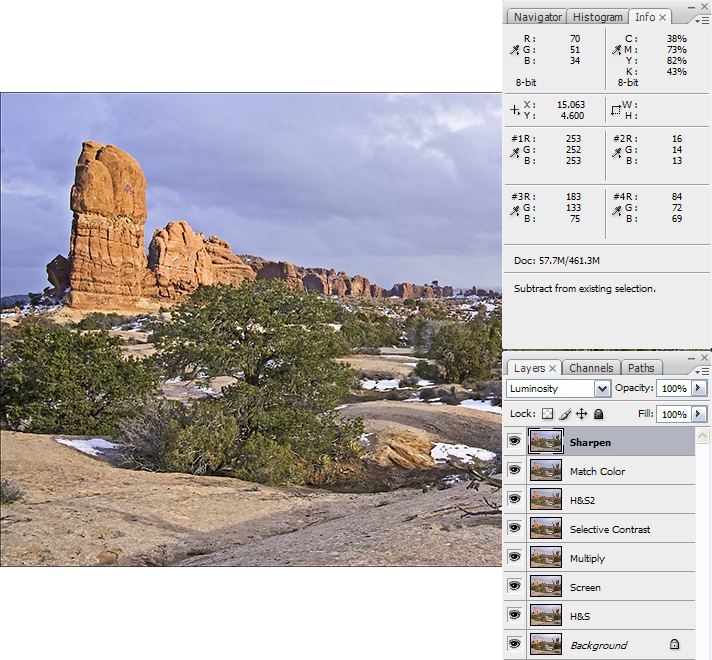
We’re almost done. Now we check for noise and sharpen the image. G.) This image does not appear to have any substantial noise, so all we need to do is apply a mild sharpening. Duplicate the image, name it Sharpen. Select Filter → Sharpen → Unsharp Mask, use the values of 65, 4, 3 and click OK. Change the blend mode to Luminosity to eliminate any halos. If this image had a noise issue I would have run a Photoshop plug-in to reduce the noise first (Noise Ninja, Kodak Digital Gem Pro, Or NoiseWare. The plug-ins seem to do a better job of noise reduction than Photoshop’s noise reducer. After the noise is removed I would then apply a mild sharpening.
After sharpening, the values in the Info Pallet are:
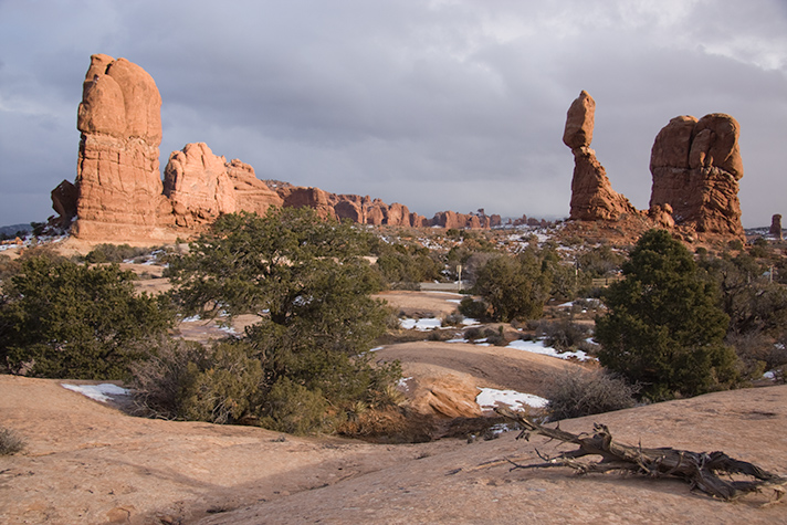
That’s it. You’ve just edited an image without touching Curves and Levels, and without blowing out any shadows or highlights. In this image the snow is pure white so a highlight value of 253 is acceptable. For most highlights however, I prefer to keep the highlight point between 245 and 250. Step 4: Convert the File Type for Web Display The only thing left to do is to convert the image into a format for the web. Select Image → Mode and select 8 bits/channel. Then select Edit → Convert to profile and select sRGB in the CS3 pull-down menu, choose File Save for web, size accordingly and then save it as a JPG. You’re done! The initial image looked like this:
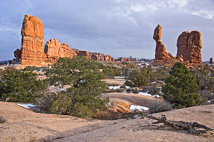
The finished image looked like this:
Here is a single table that shows how the data in the Info Pallet changes with each processing step:
In future articles, we will illustrate additional techniques for processing images, including fine art Giclée prints. Try these techniques on your own photos, and don’t be afraid to experiment. As long as you keep an eye on the Info Pallet, you will rest assured that you are not over- or underexposing the image. |
|
|||||||||||||||||||||||||||||||||||||||||||||||||||||||||||||||||||||||||||||||||||||||||||||||||||||||||||||||||||||||||||||||||||||||||||||||||||||||||||||||||||||||||||||||||||||||||||||||||||||||||||||||||||
|
|
||||||||||||||||||||||||||||||||||||||||||||||||||||||||||||||||||||||||||||||||||||||||||||||||||||||||||||||||||||||||||||||||||||||||||||||||||||||||||||||||||||||||||||||||||||||||||||||||||||||||||||||||||||
|
|
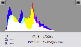 Examine the histogram. In this image, information is skewed to the left (the shadows side), meaning the image is slightly underexposed. It’s a little dark with no information on the highlight side but it has plenty of data so it’s completely fixable.